American Bankers Association - membership marketing materials
Role: VP, content, American Bankers Association
What: Membership is the main revenue driver for professional associations like ABA, and attracting new members often means finding new marketing angles. ABA is large, established, and well-known across banking, sohow do we spark interest in an audience that thinks they already know ABA? By inviting them to “Take a Closer Look.”
Deliverables I created/co-created:
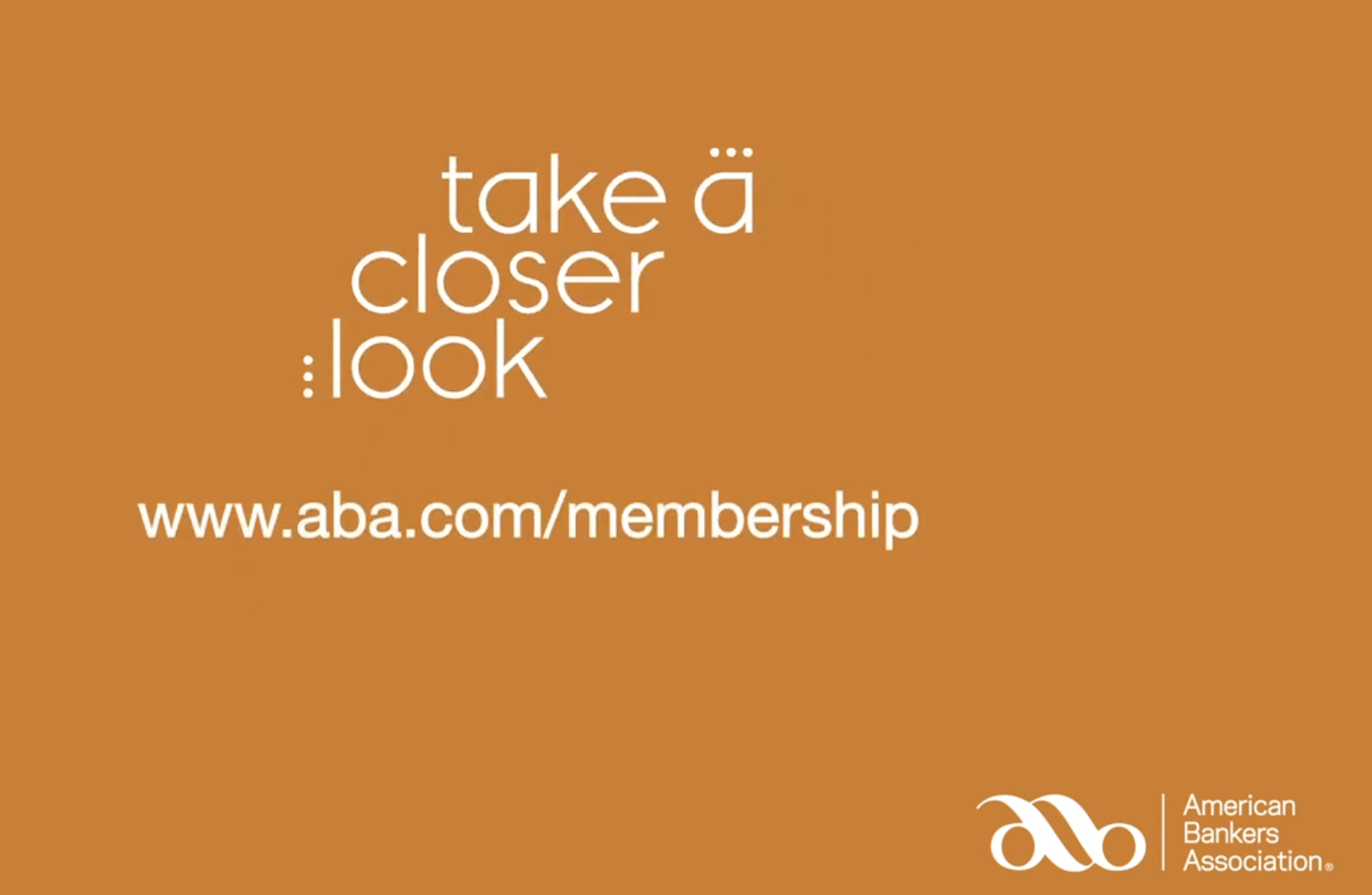
Anchor tagline ‘Take a Closer Look’
Email campaign ‘Take a Closer Look’ at key topics and news
Print materials for non-member banks
Microsite for membership messaging, and a non-member facing entry point to the main website
Promotional videos, event collateral, and signage
Messaging framework, pitch deck, and design library for main website, publications, and cross-marketing material
My process:
Identify reasons for joining ABA. By analyzing focus group content, most engaged with topics and events, our existing value proposition and marketing priorities, I divided ‘why ABA’ into six categories. These anchor the story, and give the audience a quick way to find the ‘why’ that matters most to them
Craft value propositions for each category, and map them to reusable phrases, taglines, promotional blurbs, and a visual icon
Use existing membership stats to call out bite-sized ‘data-driven’ reasons to join. Seen below on the new microsite, ‘96% of member banks, spanning all sizes and charters, renew annually’
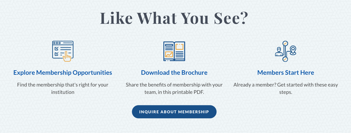
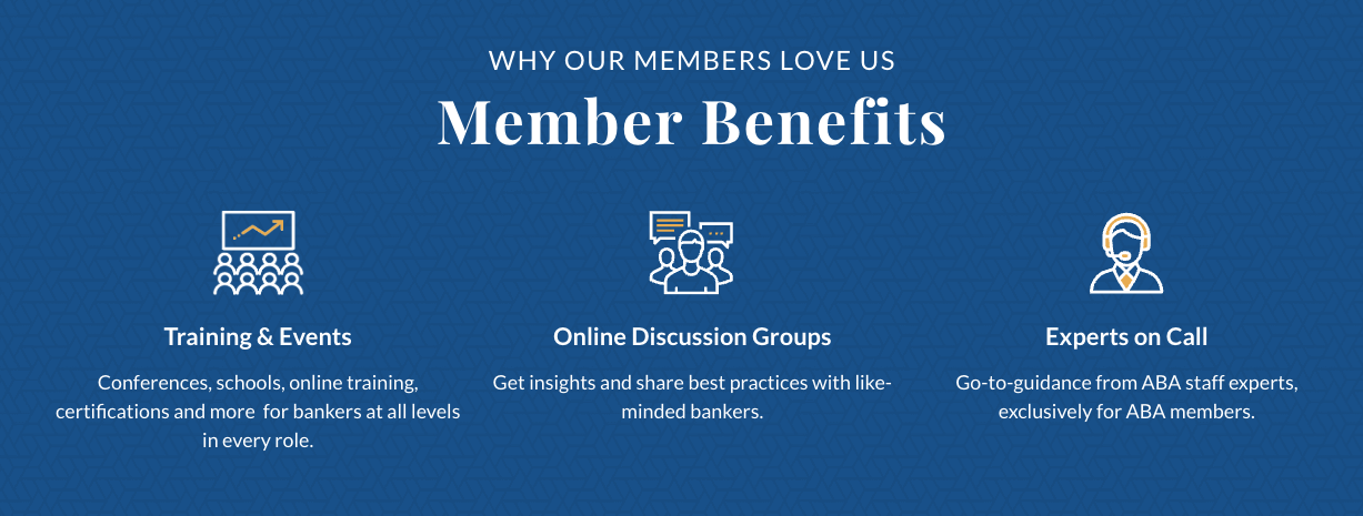
For each category, list tangible benefits and draft one-liners for a static web footer. (Static in design, dynamic in content! See below).
Tie in the ad campaign running in parallel, ‘Take a Closer Look,’ through phrasing on the site and shared visual elements
Draft and socialize a content framework outlining copy, tone, and visual features so that stakeholders know rationale and can incorporate key messaging into their planned communique.
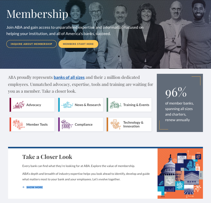
The marketing elements were carried over to the main website with a repeated footer. I created interchangeable items, so each page’s footer contains three items relevant to the content on the page. This feature also uses the campaign icons.
Complementary print and digital brochure, which has divider ‘splash’ pages that can also be used as standalone ads on the six topic areas that are featured on the website.