Booking.com - content guidelines
Role: UX writer + content designer
What I created/co-created:
Terminology base for the Flights product space, translated in 45 languages
Flights Style Guide 1.0: editorial/grammatical dos + don’ts
Patterns for headers, linked text, CTAs, and other content systems
UX Playbooks: Price display and flow, Ancillary products
Legal approval guidelines and documentation
Companywide tone-of-voice guidelines (small group of writers across verticals)
Accessibility guidelines and component libraries (served as a company Accessibility Advocate)
Let’s walk through a few of these, and my process for creating or co-creating them.
1. New tone-of-voice guidelines for the UX writing community
With new products like Flights, and a growing community of UX writers across the world, it was important to have a flexible, relevant resource for amplifying the brand voice in every product and feature.
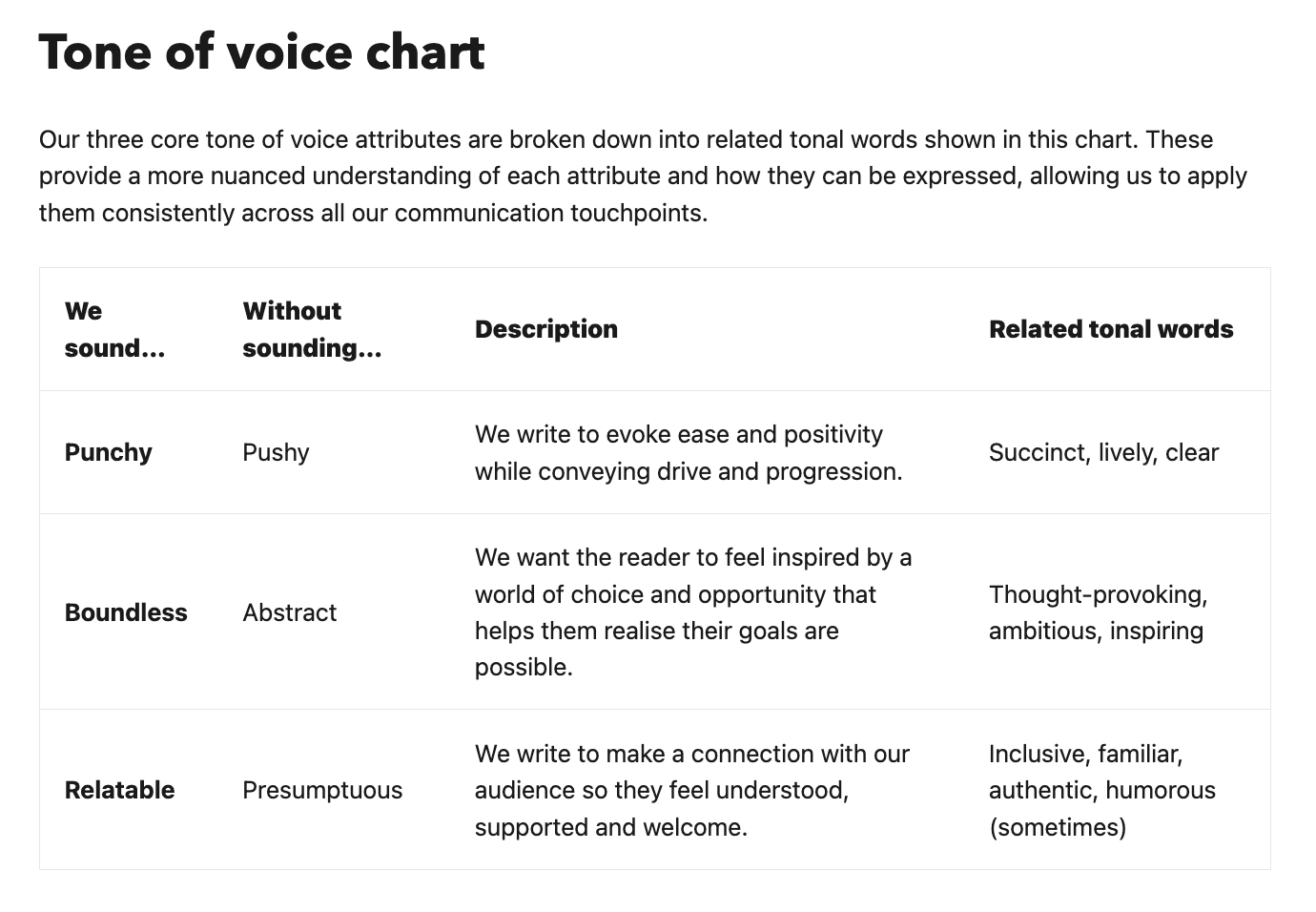
I joined a small group of UX writers representing each product area in the company to reimagine the longstanding ToV into three key elements: punchy, boundless, and relatable.
How? Through User testing, close collaboration with language specialists to understand what works in our biggest markets and whether there were gaps, brand perception surveys, customer feedback, travel industry trends and data, and competitor analysis.
The main takeaway: the brand was all about simplicity, both in language and the book process itself. So we broke down this differentiator into the three core attributes of punchy, boundless, and relatable.
Snippets of the guidelines I co-created, ‘Writing in the right tone’:
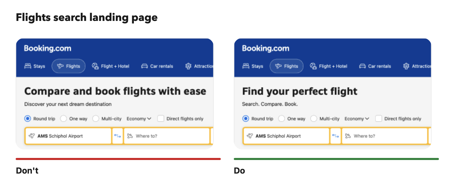
Dos and don’ts visual examples, which also spurred new lines A/B testing:
Tone guidelines FAQs:
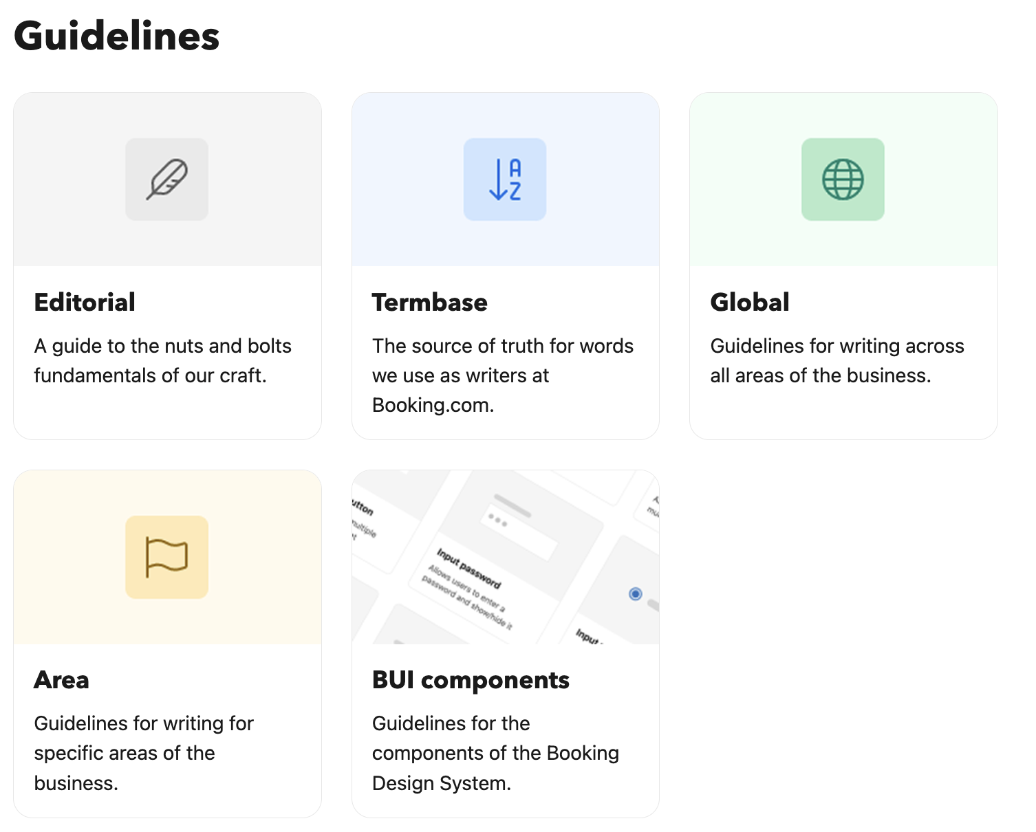
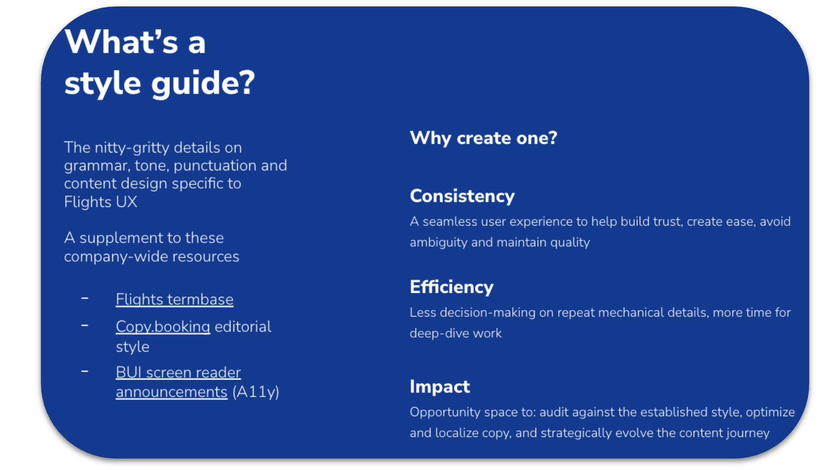
2. Flights Style Guide 1.0
Flights, as a fledgling product in a mature company, also needed its own set of rules. I led the creation of the Flights Style Guide 1.0, the first published resource on terminology, UX content patterns, legal dos and don’ts, and all things writing for Flights.
Writing guidelines across the company are now divided by Global and Area, helping each product space have the specificity, and sometimes flexibility, it needs to stay true to its brand within a brand.
Why write a product specific style guide, when company resources seemed abundant? Because before you can own and elevate content quality, you have to define what it means for your space.
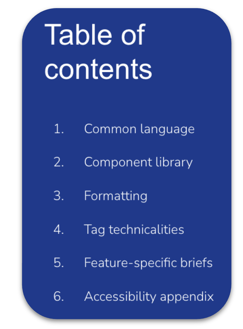
Flights Style Guide presentation and ToC
Our very own style guide for Flights has proven a valuable tool in just 12 short months since its launch. Its impact so far:
Source of truth for stakeholder management - less conversations about ‘why’ we write (or avoid) certain words or phrases
Supports the company goal of ‘The Connected Trip’ - users who see the same language (i.e., ‘trip’ vs ‘journey,’ ‘flight’ vs ‘ticket,’) are more likely to transact in >1 product area
A baseline for injecting aspirational tone. No more worrying about inconsistent terminology - now we could focus on enhancing the story rather than always ‘fixing’ it
Consistency became acceptable rationale for changing copy. Product teams are quicker to market with platform parity improvements now that there’s a documented ‘right’ way to write
Onboarding and alignment - I began presenting the Flights Style Guide to all new joiners in the product space, and UX writers across the company now have a resource when designing cross-sell, marketing campaign, or other features external to Flights
3. Accessibility guidelines
Flights became the first product in Booking.com to achieve 100% WCAG compliance, due in large part to the UX community’s commitment to documenting best practices, and improving internal design systems to ensure accessibility.
In addition to design guidelines, a Figma plug-in, and more, I co-authored copy guidelines on inclusive writing, and accessible writing for our design system.
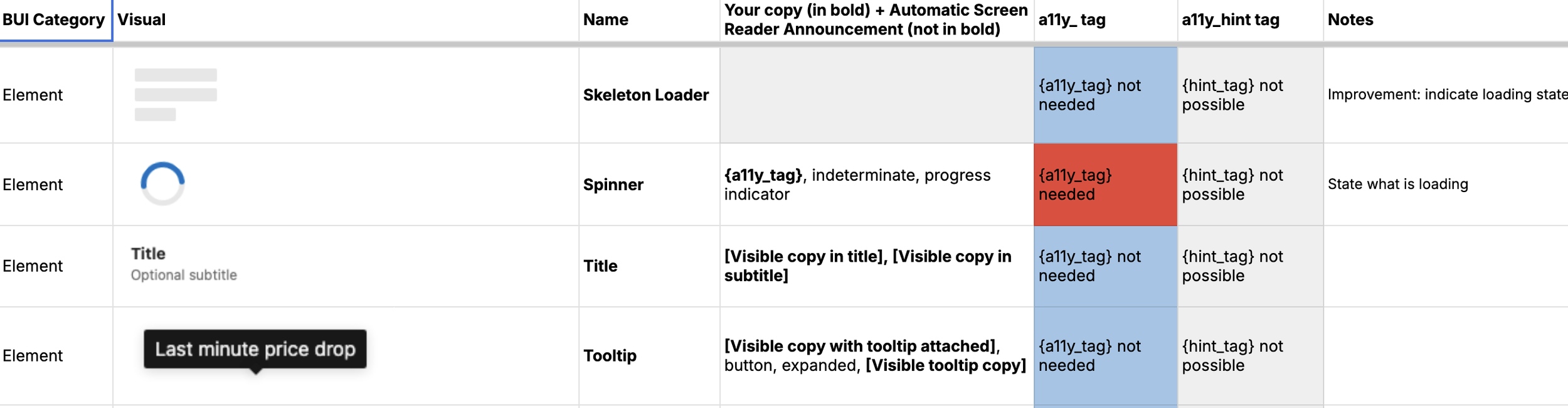
The resource ‘How does my copy sound?’, breaks down each component across our design system and how they function with assistive technology. For each element, writers, designers, or engineers can quickly understand how to label and what is or isn’t accessible out of the box.