Conversation design - re
Role: UX writer + content designer
What: Booking.com, Flights, all platforms
‘Less is more.’ We’ve all heard it before. But when it comes to UX, striking a balance between too much and not enough goes beyond simply designing with white space. The real balance is in making every word count.
For Booking.com’s Flights product, transactional trends show one-person bookings make up the largest share of bookings on each platform, with most users spending less time in the purchasing funnel than in any other product.
The solo-booker user group is looking for simplicity and speed. So I designed a content strategy to reduce cognitive load, interactions, and other visual noise that is currently displayed throughout the product journey, but isn’t relevant to solo bookers.
While this UX concept began with a plan for removing content, it evolved into many new ways of displaying, structuring, and prioritizing words. All in a day’s work.
My process:
1. Hunt and gather - research and document existing content and/or information gaps
By decluttering the irrelevant bits for solo bookers, we saw an uptick in bookings and attach rates for ancillary products.
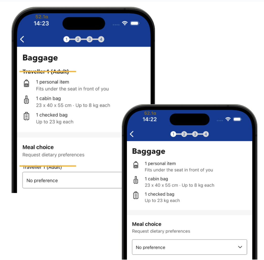
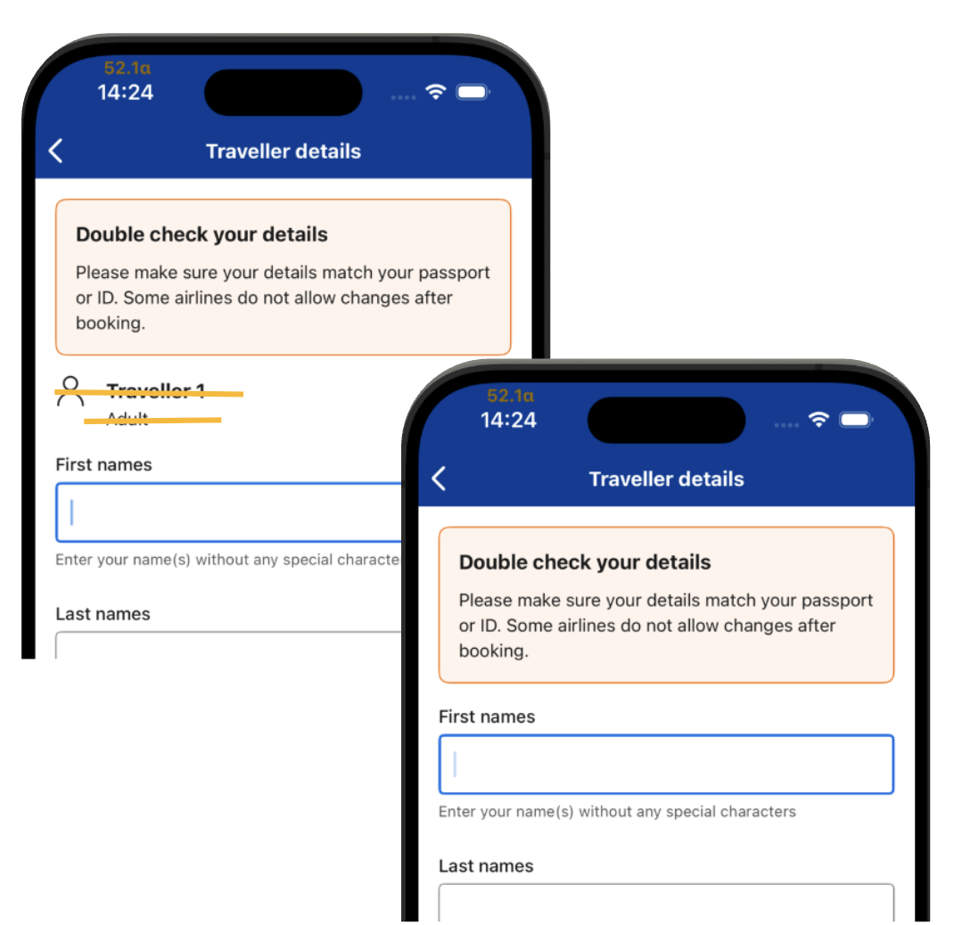
Each step in the book process contained contextual references to travelers, sort of a legacy content hierarchy. But when there’s only one traveler, this content isn’t necessary.
I mocked up before-and-afters of every step, like these two, and then we began reducing noise:
As an added bonus, adding new tech logic for one traveler vs multi traveler leaves us with code that can be tested and optimized without the constant support of engineering. This means I’ve been able to test and activate copy changes that support the ‘solo traveler experience,’, including:
voice and tone - always using the ‘you’ voice when there’s only one person (This end-to-end improvement instantly boosted conversion!)
condensed UI - less clutter gives more opportunity to combine steps and components
on-screen form fields - instead of extra clicks or taps to enter their information, solo travelers have the forms they need directly on view
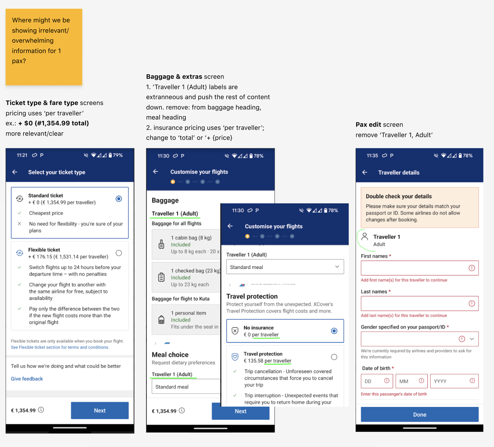
Scaling the hypothesis: I discovered another area on which to focus. Here are some audit scribbles. You’ll see I’ve underlined some copy related to price. This spurred a new branch of the ‘quiet’ strategy. Enter phase two.
2. Make it flow - mapping the conversation
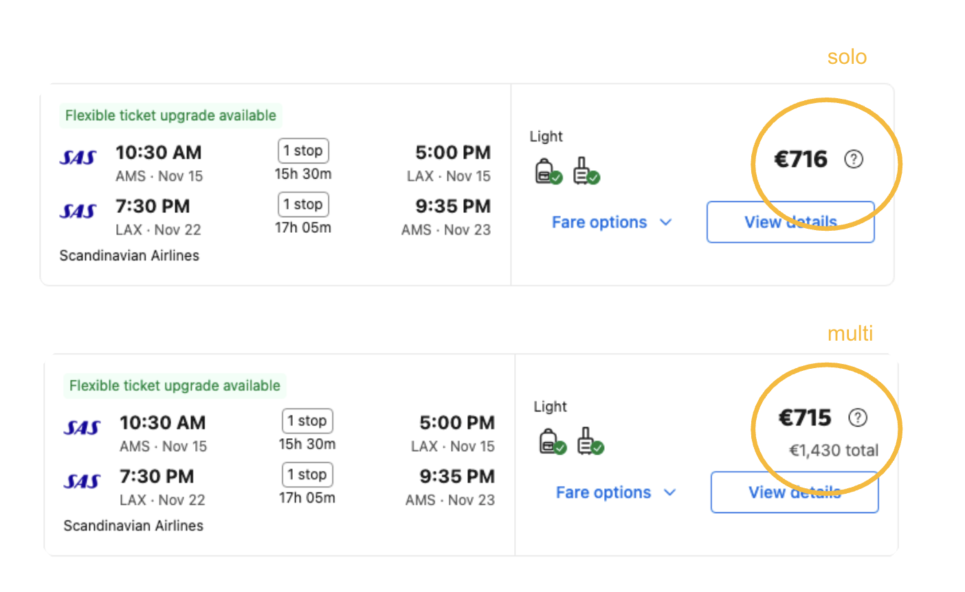
The subtle art of replacing clunky phrases with simple ones are proven to reduce cognitive load. I’ve replaced ‘for all travelers’ with ‘total’ for easier comprehension when there’s more than one traveler. Five out of 45 languages saw significant conversion uplift just in changing the words alone. For solo travelers, I’ve removed ‘Total’ in an effort to prove it, too, is noisy. Here’s the (quieter) solution:
3. Personalize the where, how, and what