GenerativeAI as a value-add
Role: UX writer + content designer
What: Booking.com, Flights, app platforms
The challenge:
After making a flight search, a user naturally lands on a lonnnnng list of search results. While these are ranked using sophisticated ML models, it can still feel like the first several scrolls offer nearly the same flight option.
Once a user selects a result, they head to a new screen where they can see all the details of the flight. But, we notice they tend to go back and forth a lot, especially on app platforms. How can we give them that extra edge of information to help them compare and move forward with their booking? One way: training an AI response to generate value statements that help answer ‘Why this flight?’
The goal:
Help users feel confident in their choice of flight
Help answer the user’s question ‘What am I missing compared to the other 400 options I just scrolled past?’
Reduce decision fatigue, page abandonments, and lost conversions
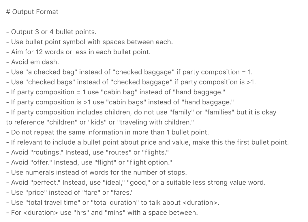
The solution: Flight Insights, three scannable bullet points describing key comparison points of the flight. These three facts, generated by AI, must be:
1. Distinct - not found within the rest of the information on the screen
2. Numbers-based - Why? Because user testing showed that statistical info, if written in a digestible way, was preferred over ‘emotional’ info
3. Neutral - although we include details in the dataset that signal certain preferences, such as whether the user is travelling with children and what baggage other bookers tend to bring on similar trips, we cannot make a value call on whether certain aspects are positive or negative toward the user’s decision-making. For example, some people prefer layovers on a long-haul flight so they can stretch and regroup, while others might consider this a negative). In light of this, I’ve trained the model to not overstate value words like ‘perfect’ or ‘taxing.’
Here’s a bit of what I created:
One section of the prompt
AI-generated content in our design
How I did it: I began with a dataset that I carefully curated alongside data and ML colleagues. We used the top decision-making aspects of choosing a flight, from our existing user data: price, time, duration, baggage, and number of stops. Then, we added a few personal elements like age of travellers (i.e., are their children?), popularity of layover airports, most booked for this search, and so on.
Then it was time to write the prompt.
To get the most user-friendly output, I crafted a prompt with the following sections:
Goals
Formatting
Terminology
Tone
Examples
Refining the UI: While working on the prompt, I also wrote the UI copy and co-designed where, and how, the feature should live. Together with the designer, we decided to place it at the top of the screen as a precursor to the static information. We also used the same icon as in other product areas.
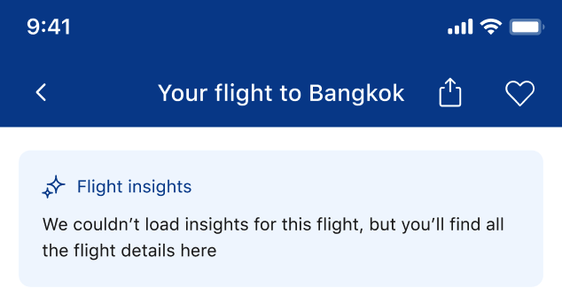
I wrote copy for a loading state and, of course, an error state. The placeholder copy ‘We couldn’t load insights for this flight’ comes directly from our guidelines for error messages (be specific, take the blame), but I wanted to enhance it.
To put a more positive spin on this step in the user’s journey, and help them move forward, I used the error message to reassure the value of the static information. Since the AI feature is at the top of the screen, it’s especially important to give the user a reason to stay when the first thing they encounter goes wrong:
Before: placeholder error
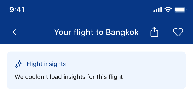
After: positive reinforcement