Decoding payment error codes - and earning user trust
Role: UX writer + content designer
What: Booking.com, Flights, all platforms
The problem space: Data tells us failed bookings due to payment rejections are seldom recovered, even though the user has made the choice to transact. An audit of the existing flow on all platforms shows many gaps in the frontend experience. Is there information on the backend that can help fill them, or do we have a tech problem? Turns out, a bit of both.
Hypothesis: If we tell the user what went wrong with their payment, and allow them to retry on the payment screen itself, they’ll be more likely to complete their booking
The before: less-than-ideal UX
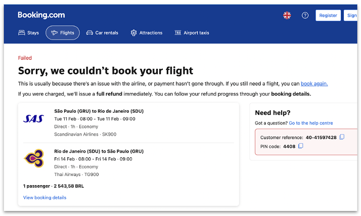
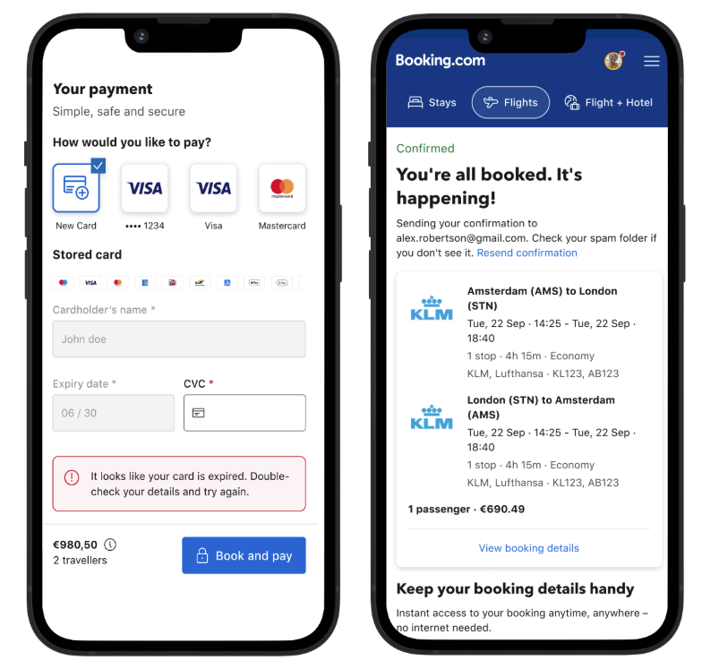
In most cases, a payment error immediately led to ‘failed’ confirmation screen
Going back to try again bumped users to the beginning, with nothing saved
The user’s endpoint, the ‘failed’ confirmation screen, mentions a potential payment error, but doesn’t provide a way forward. We also do not confirm whether or not the user was charged.
Yikes
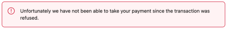
In one case on the backend (if the bank refused the transaction), we were showing an error banner (below). This is problematic because:
We’re placing blame on ‘something else,’ but we don’t sound very empathetic apart from ‘unfortunately’
We use a red warning icon indicating something went wrong, but we don’t explain what happened to the booking
Despite the newly appearing error, the user still has a dead-end
Yikes again
What I did:
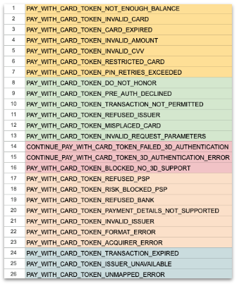
Collaborated with engineers to investigate payment error codes, and what we were receiving
Groupd the error codes into common, user-friendly scenarios
Wrote new, contextual, and user-friendly messages for each group
Got legal approval on whether we can contextualize payment-related language, and by how much. This was a more productive discussion with prewritten messages they could react to, despite having to scale a few back.
Worked with engineering and design to define the UX requirements for ‘trying again’ - how many attempts could a user make before landing on an official ‘failed’ page? What does the experience look like? What content was missing before, during, or after a user taps the ‘Pay’ button
Localized into 45 languages, keeping tone and sensitivity in mind. Some languages prefer not to sound conversational or apologetic when it comes to transactional moments. And that’s okay, as long as we’re consistent.
Error code grouping with engineers
The after:
On-the-spot recovery - the user can make the fix on the same screen
Functional, yet friendly - keeping in the punchy and relatable tone-of-voice, but explaining what caused the error, in plain terms
Copy that leads with action - the user should read the error message and know what they can do
Ease of use - no back navigation required to retry, and less guesswork for the use
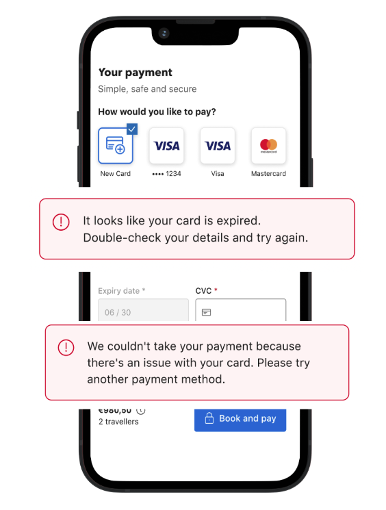
Two of five new messages
How I scaled beyond the MVP: Because UX is a perpetual cycle of improvement, I asked myself how else can I apply contextual errors to the end-to-end flow. I started with an audit, and worked out three must-do next steps.
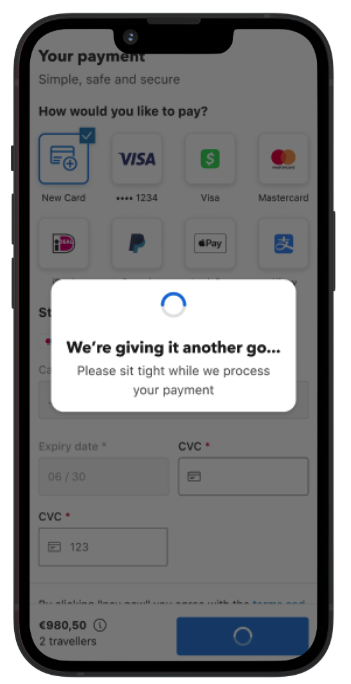
1. Expand the scope of what we already did - can we better signal something is loading, especially considering the user’s payment is processing in the back ground. Can we make the confirmation screen more personal and emotional? The answer to these is yes.
Not only did I write a new ‘payment loading’ state, I also split the logic so this use case felt seen and heard. Since they’re recovering from a payment error, I’ve said ‘We’re giving it another go.’
2. Look beyond payments - using the hypothesis that users need visual and contextual cues of things ‘moving or changing’ in the background, where else can we apply this UX approach? I began to design similar improvement strategies for: form field errors, empty searches/empty states, outages, and all loading states.
I’m particularly proud of my loading state content strategy, titled ‘What Is Happening?’ Not only do users stick around when you tell them something is loading in the background, they also trust you enough to transact!
3. After we built the payment loading state, could we still optimize further? Which messages performed better? Can we hypothesize why? Do we need to test alternative designs?
Friendly loading message
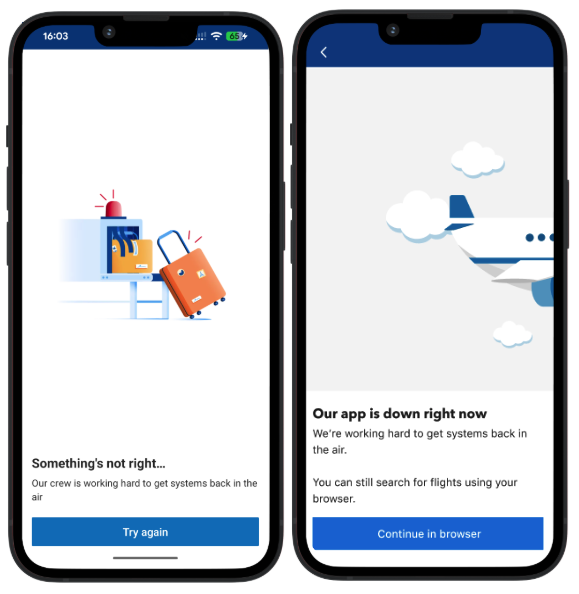
Before and after: contextual outage message with a clear, positive action