Flight price alert feature - subscribe, engage, convert
Role: UX writer + content designer
What: Booking.com, Flights, app platforms to start
The goal: Launch an industry-standard feature for users to track prices on their flight search. On the app, users must be able to tell us where they want to fly and when, and we’ll send price alerts through push notifications, profile alerts, and other visual cues in the end-to-end journey
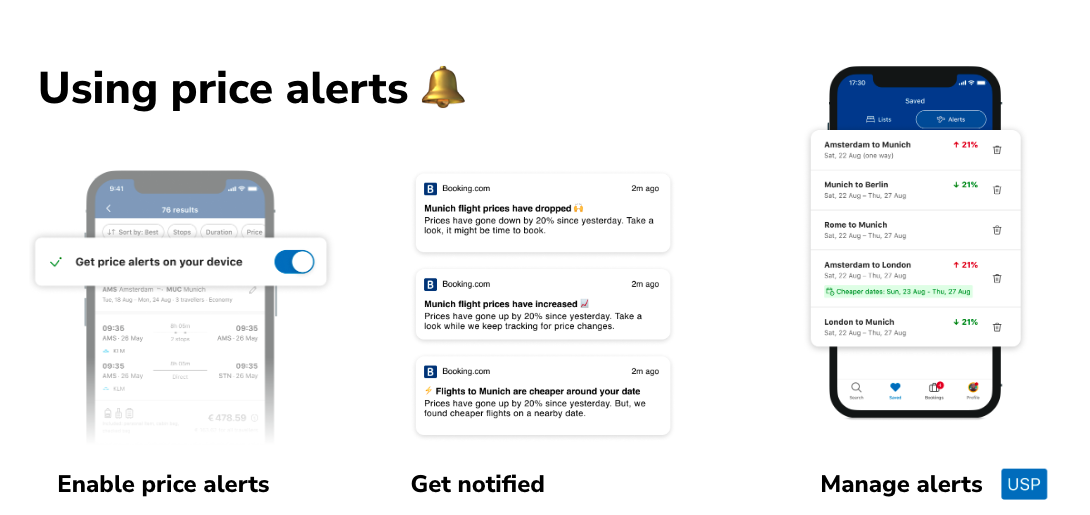
The MVP solution: From discovery to alert management, here are three key journey points
My process:
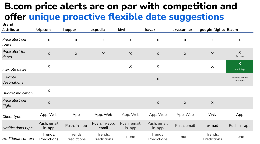
1. Discovery - understand our tech and see what competitors are doing. By creating this competitor analysis table, I came to the conclusion that if we combined notifications about flexible alternative with the price alerts feature as is, we’d be offering something that could differentiate us.
So then we got to work combining the two technical capabilities.
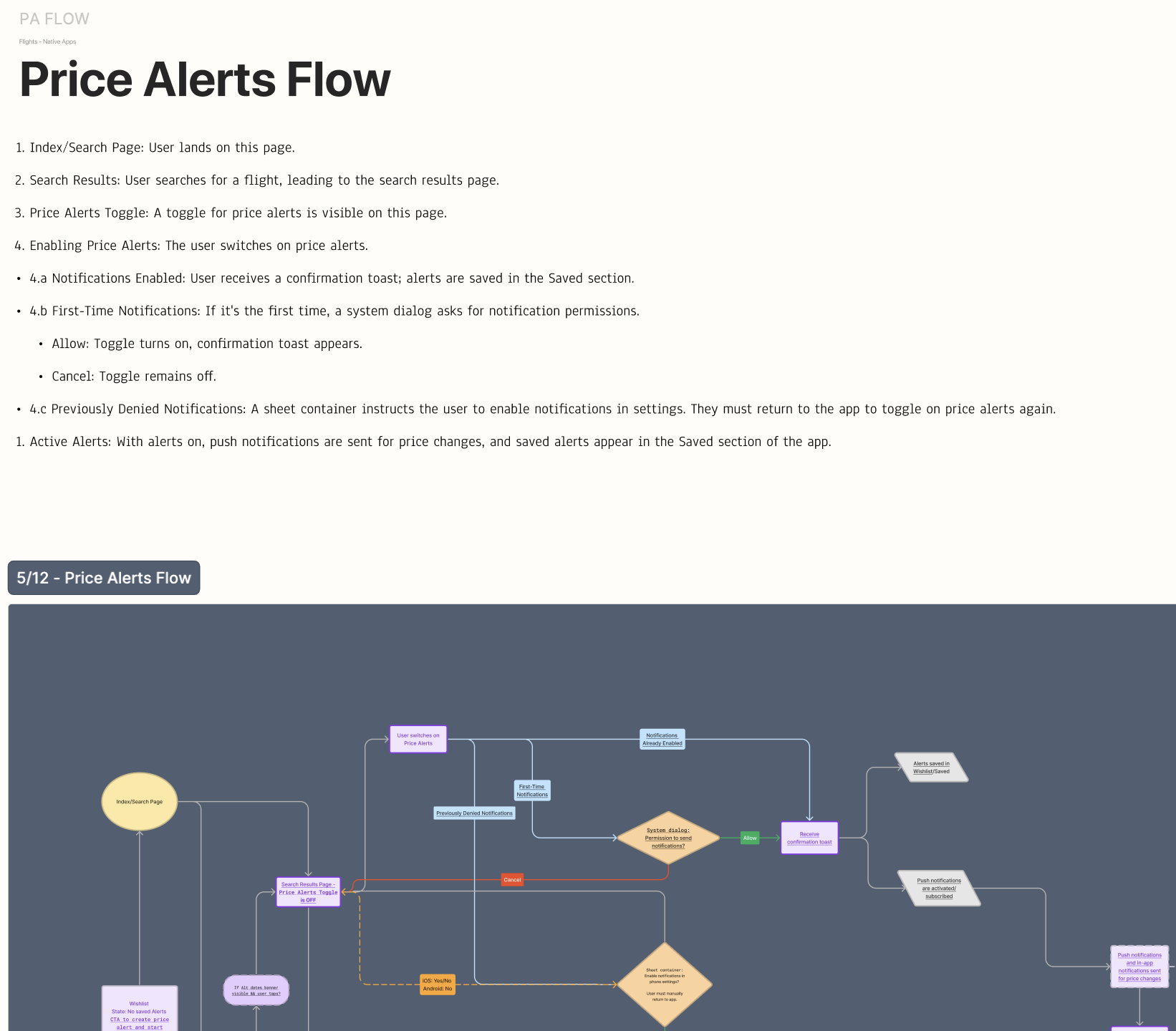
2. Map the end-to-end vision - it started in writing, which isn’t always the case.
3. Solve a few content puzzles along the way - building a subscribe flow that fits the existing ecosystem
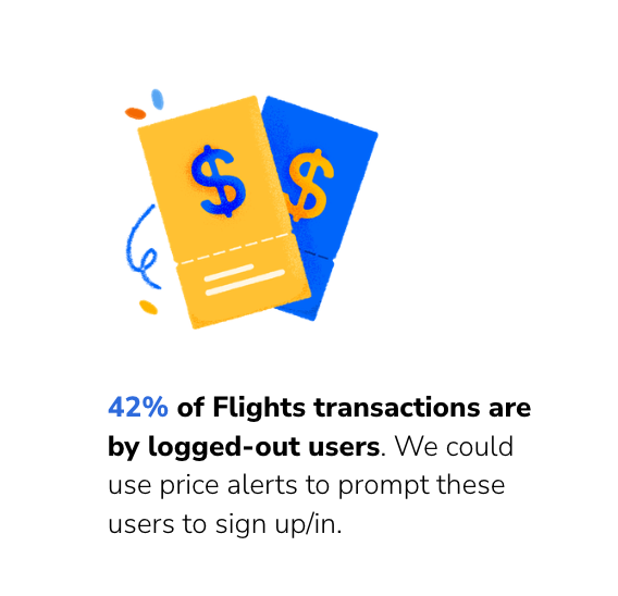
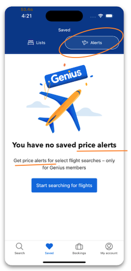
Encourage log-ins by designing a messaging flow for logged out users based on the appeal of price alerts
Define the hierarchy of information when there’s competing content in the top real estate of search results
map the various use cases, from emergency travel alert banners to legal disclaimers and live deals, and set rules for how and where to display the price alerts opt-in
explore the price alerts opt-in as a floating button to mitigate the issue (this didn’t perform well!)
Simultaneously solve the ‘app gap’ - design a ‘get the app’ flow to encourage users
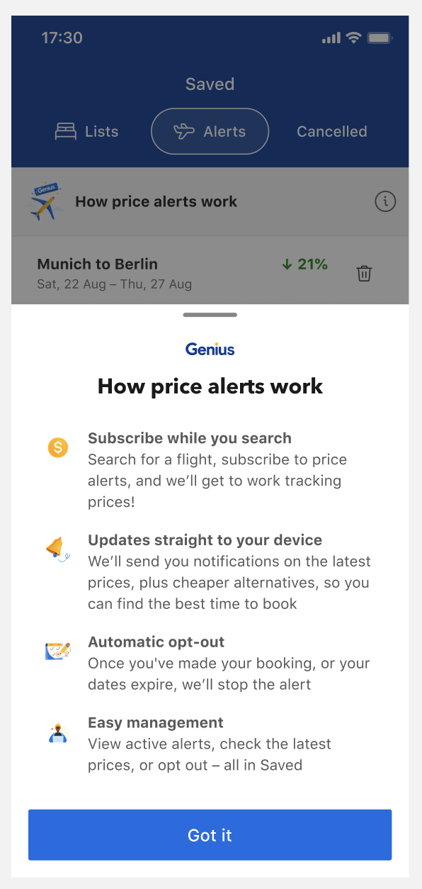
Build a less intrusive, relevant explainer - here, we’re opting to attach a bottom sheet to where the alerts are stored, which is when the user is in the mindset of managing their alert
Presentation data point for an iterative design for logged out users
‘How price alerts work’
4. Test and optimize - learnings and next steps
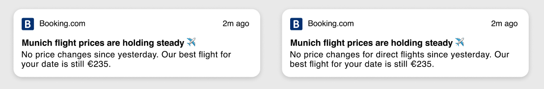
Push notifications performed best within 5 days from setting the alert, regardless of whether the notification is about a rice or a fall in price.
Next step: consider adding a ‘neutral’ push notification (‘prices are still in line with your last search’) for an extra opportunity to get a user back into the funnel
Aspirational messages that didn’t feel ‘nerdy’ or contain numbers saw almost no engagement. Users are apathetic to messages about ‘booking that dream trip’ or ‘sunny Bali awaits’ - perhaps they’re saturated on other saving or sharing features
Next step: build more price trends content, so the statistical push notifications have anchor content for the user to explore and make decisions with. Things like: a comparison feature, expanded content from the price alerts home (an accordion or a new screen), a ‘you might also like’ feature based on what they’re tracking, a ‘x number of people booked this in the last x days’ alert
Scale the feature to it's ‘homescreen,’ which is out of our product team scope. When it comes to flights, ‘alerts’ may hit too close to things like flight status updates and other day-of travel messages. How do we know this? We don’t have hard data, but it’s a hypothesis to test to boost subscriptions and engagement
Next step: copy test price alerts vs price tracking vs watch prices
‘Neutral’ push notifications
Optimize this copy - Is ‘alerts’ clear? We haven’t defined price alerts, instead it’s repeated in the header and subheader. To test new copy here, we have to align with an external team. This is sometimes hard to do in an MVP or launch solution.