ABA.com - website redesign
Role: copywriting + content strategy
Key stakeholders: internal marketing, communications, design, and executive teams; external engineers, brand consultants, and third-party tech/software teams
As the face of American Bankers Association, ABA.com is a home for bankers and consumers to get news, join events (or, join ABA!), understand financial topics, and manage their membership.
The project included both a public-facing site and a members-only e-commerce and registration platform. With this project, I began to deeply understand user experience, and made the transition to product content design.
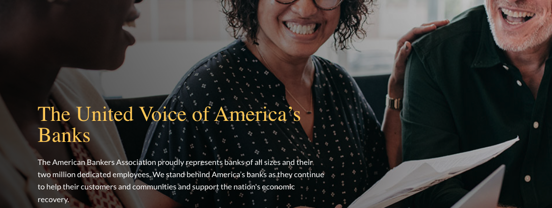
New hero, stronger mission statement
A historical deep dive, competitor analysis, focus group, and audit of existing marketing materials led to refreshed mission statement for ABA.
This is the anchor of ABA’s voice, visible on the homepage with rotational hero images. It was the first time ABA brought their consumer tagline ‘America’s Banks’ into their identity. Above is the ‘COVID recovery’ version, as my concept included a dynamic second sentence.
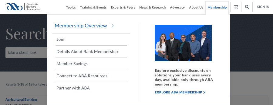
Navigation + taxonomy
Navigation menus are simple and concicse, and hold space for one relevant marketing blurb, boosting exploration, time on the site, and engagement.
Taxonomy and tags were overhauled and help the site scale.
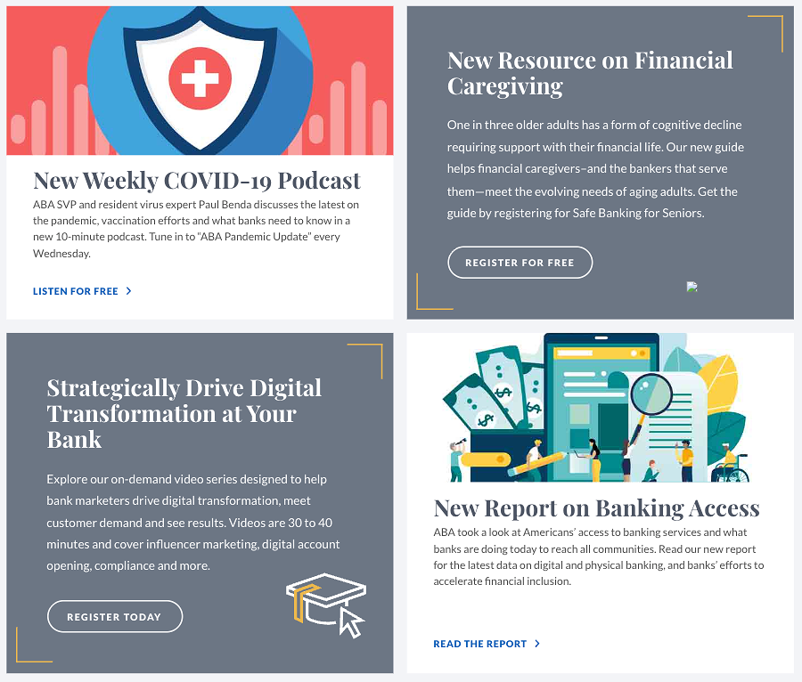
CTA deep dive
We tested button styles and CTA copy for the homepage ‘anchor’ elements, four relevant promotional or news items to keep the site fresh. After a series of A/B tests measuring clicks (and conversion on relevant offerings), I created a CTA library with repeated phrasing, action-oriented terms, and copy conditions like when to use the word ‘free’ or when to convey urgency.
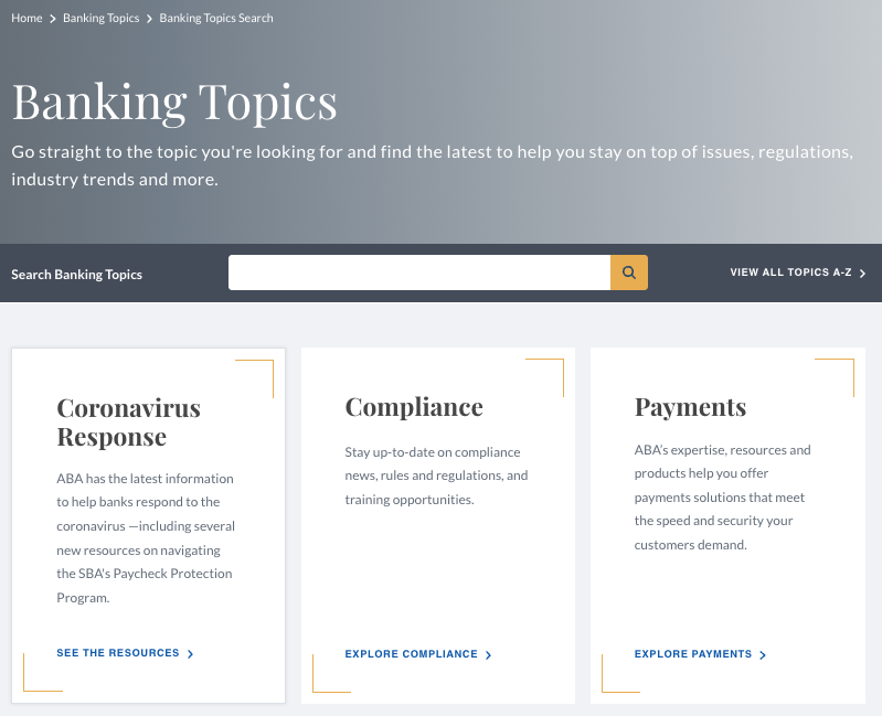
‘Mini’ USPs for each topic
A new topic library helps group banking content, which can be technical and complex, into buckets that people of any level of banking expertise could understand. After identifying the topic list, I gave each topic a USP so consumer visitors to the site feel compelled to explore what’s there.
By building the site architecture around these topics, content is easy to discover, and new assets or information always have a home.
In a nutshell:
Copywriting and content design for homepage blurbs: marketing content, news announcements, and other resources.
CTA library for unique, action-led, easily localized language
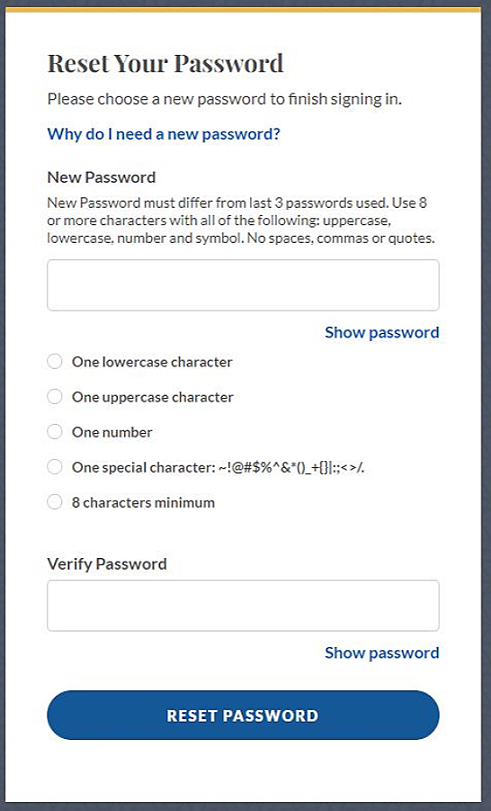
New login flow with form fields, password validation, and profile homepage
Banking topic cards with ‘mini USPs’
User-tested search bar, which went through several iterations
Navigation dropdown with intuitive content architecture and a marketing ‘sidebar’